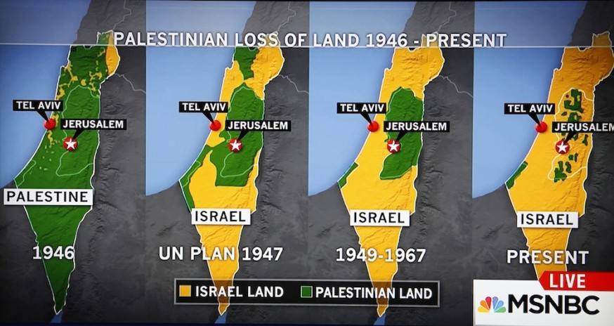
Earlier this month, MSNBC aired a well-known, but controversial graphic that illustrates how Israel has taken over Palestine as the occupation of the region has grown over time.
The graphic, which appeared during an Oct. 15 discussion between MSNBC anchor Kate Snow and Martin Fletcher, a Middle East correspondent, shows a series of four maps dating from 1946 to the present that depict the loss of Palestinian territory to Israel.
During the segment, Fletcher discussed the ways that Israel’s provocative behavior at Al-Aqsa Mosque is a major trigger for the latest violence in Gaza and the West Bank, then Snow introduced the graphic as it appeared on screen, saying: “What does that show you, Martin, that the area Palestinians are living, has it grown increasingly smaller?”


